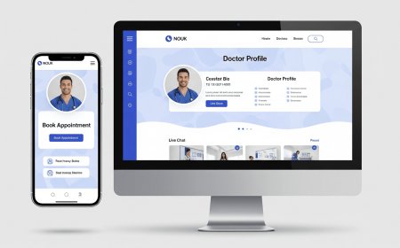
How to Design Responsive Website
Introduction Designing a responsive website is essential in today’s digital landscape, where users access content from a variety of devices including desktops, tablets, and smartphones. A responsive website automatically adjusts its layout and elements to fit the screen size and resolution, ensuring an optimal user experience regardless of the device used. This tutorial provides a comprehensive gu
Introduction
Designing a responsive website is essential in todays digital landscape, where users access content from a variety of devices including desktops, tablets, and smartphones. A responsive website automatically adjusts its layout and elements to fit the screen size and resolution, ensuring an optimal user experience regardless of the device used. This tutorial provides a comprehensive guide on how to design a responsive website, covering fundamental concepts, detailed steps, best practices, essential tools, real-world examples, and frequently asked questions.
Step-by-Step Guide
Step 1: Understand the Basics of Responsive Design
Responsive web design (RWD) is a design approach that uses flexible layouts, images, and cascading style sheets (CSS) media queries to adapt the websites presentation to different screen sizes. The core principle is to create a single website that works well on any device, eliminating the need for separate mobile and desktop versions.
Step 2: Plan Your Website Layout
Start by sketching wireframes or mockups for various screen sizes: mobile, tablet, and desktop. Prioritize content and navigation to ensure usability on smaller screens. Consider a mobile-first approach, designing for smaller screens first and scaling up to larger devices.
Step 3: Use a Fluid Grid Layout
Implement a fluid grid system using relative units such as percentages rather than fixed units like pixels. This allows page elements to resize proportionally based on the screen width. CSS frameworks like Bootstrap or Foundation come with built-in grid systems, but you can also create custom grids using CSS Flexbox or CSS Grid.
Step 4: Make Images Flexible
Use CSS properties such as max-width: 100% and height: auto to ensure images scale with their containing elements. This prevents images from overflowing their containers on smaller screens.
Step 5: Implement CSS Media Queries
Media queries allow you to apply different CSS rules depending on the devices characteristics like screen width, resolution, or orientation. Define breakpoints where the layout will change to better suit the device.
Example:
@media (max-width: 768px) {
/* CSS rules for tablets and smaller devices */
}
@media (max-width: 480px) {
/* CSS rules for mobile phones */
}
Step 6: Optimize Navigation for Small Screens
Navigation menus should be easy to use on touch devices. Common solutions include collapsible hamburger menus or off-canvas navigation. Ensure clickable areas are large enough to prevent user frustration.
Step 7: Test Responsiveness Across Devices
Use browser developer tools to simulate different screen sizes and resolutions. Additionally, test on real devices to validate usability and performance. Pay attention to readability, button sizes, and loading speed.
Step 8: Improve Performance
Responsive websites should load quickly on all devices. Optimize images by compressing them and using modern formats like WebP. Minify CSS, JavaScript, and HTML. Consider lazy loading for images and other media to improve load times on slower connections.
Step 9: Ensure Accessibility
A responsive site must be accessible. Use semantic HTML5 elements, ensure sufficient color contrast, and make the site navigable via keyboard and screen readers. Responsive design and accessibility often go hand-in-hand to create an inclusive experience.
Step 10: Maintain and Update
Responsive design is an ongoing process. Continuously monitor user behavior, screen usage statistics, and emerging device trends. Regularly update your sites CSS and layout to accommodate new devices and improve user experience.
Best Practices
Mobile-First Design
Designing for mobile devices first forces you to prioritize essential content and features. It also helps create a more streamlined, efficient user experience that scales well to larger screens.
Consistent User Experience
Maintain consistency in navigation, typography, and interactions across all devices. This builds user trust and improves usability.
Use Scalable Vector Graphics (SVG)
SVGs are resolution-independent and scale perfectly on any device without losing quality. Use SVG for icons, logos, and simple illustrations.
Typography and Readability
Choose legible font sizes and line heights for small screens. Use relative units like em or rem for font sizes to improve scalability.
Touch-Friendly Elements
Ensure buttons and links are large enough (at least 44x44 pixels) to be easily tapped on touchscreens.
Progressive Enhancement
Build basic functionality that works on all browsers and devices, then add advanced features for capable browsers using feature detection.
Optimize for Speed
Responsive design should not come at the cost of performance. Use optimized media, reduce HTTP requests, and leverage browser caching.
Tools and Resources
CSS Frameworks
Bootstrap A popular front-end framework with a responsive grid system and pre-built components.
Foundation Another robust framework focused on responsive design and accessibility.
Design Tools
Figma A collaborative interface design tool with responsive design features.
Adobe XD Useful for creating responsive prototypes and wireframes.
Testing Tools
Browser Developer Tools Chrome DevTools, Firefox Developer Edition provide device simulation and debugging.
Responsinator Online tool to test how websites look on various devices.
Google Mobile-Friendly Test Analyze if pages are optimized for mobile devices.
Image Optimization
ImageOptim Desktop tool for compressing images without quality loss.
TinyPNG Online service for compressing PNG and JPEG images.
Real Examples
Example 1: Apple
Apples website adapts seamlessly across devices, employing a clean grid layout, scalable images, and intuitive navigation. The mobile version prioritizes key product information and uses touch-friendly controls.
Example 2: Airbnb
Airbnb uses flexible layouts and media queries to optimize its search and booking experience on all devices. The site loads quickly and maintains consistent branding and functionality from mobile to desktop.
Example 3: Smashing Magazine
Smashing Magazine is a prime example of responsive design, with fluid typography, well-structured content, and responsive images that enhance readability and engagement on any screen size.
FAQs
What is the difference between responsive and adaptive web design?
Responsive design uses fluid grids and media queries to create layouts that adjust smoothly across all screen sizes. Adaptive design uses fixed layouts tailored to specific device categories, detecting the device and serving the appropriate layout.
How do I choose breakpoints for my responsive design?
Breakpoints should be based on your contents natural flow and common device widths rather than specific devices. Analyze your sites analytics to understand the most popular screen sizes among your users.
Can I make an existing website responsive?
Yes, but it may require significant redesign and restructuring of CSS and HTML. Its often easier to build a responsive site from scratch or using a responsive framework.
Does responsive design affect SEO?
Yes, responsive design positively impacts SEO by improving user experience, reducing bounce rates, and meeting Googles mobile-first indexing requirements.
Is responsive design only about screen size?
No, it also considers resolution, orientation, and device capabilities to tailor the user experience comprehensively.
Conclusion
Designing a responsive website is a critical skill for web developers and designers aiming to deliver excellent user experiences across diverse devices. By understanding the fundamentals, following a structured approach, adhering to best practices, and utilizing the right tools, you can create websites that are both visually appealing and highly functional. Responsive design not only enhances usability but also supports SEO and accessibility, making it an indispensable aspect of modern web development. Start with a mobile-first mindset, focus on flexible layouts, and continuously test and optimize to ensure your website performs flawlessly on every device.


